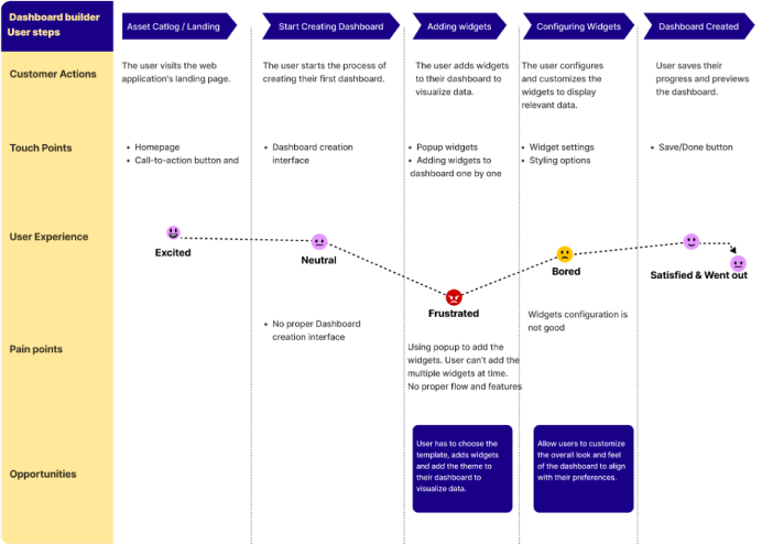
Problem Statement
-
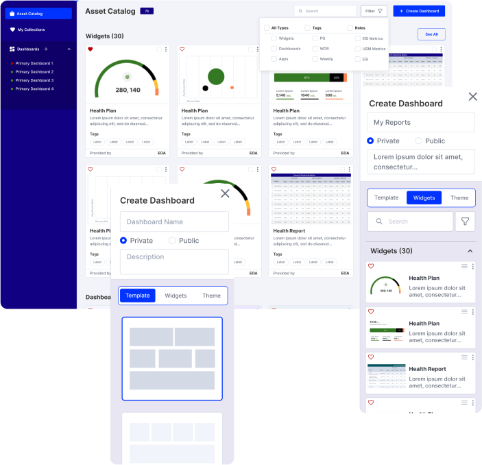
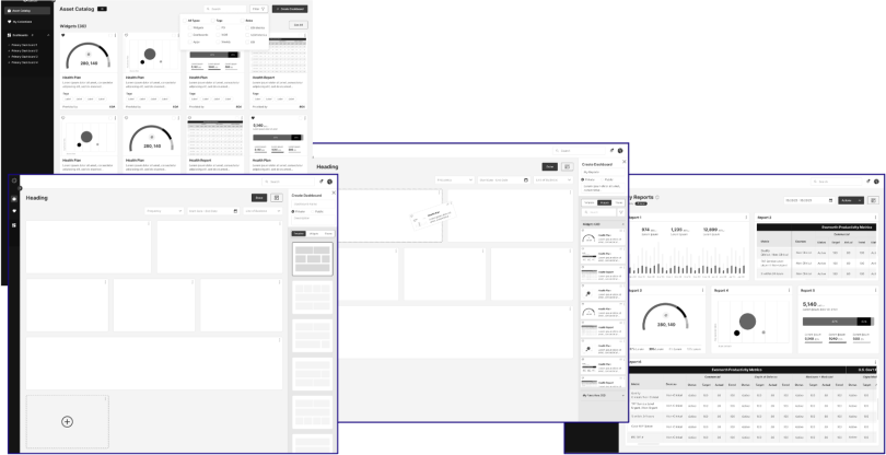
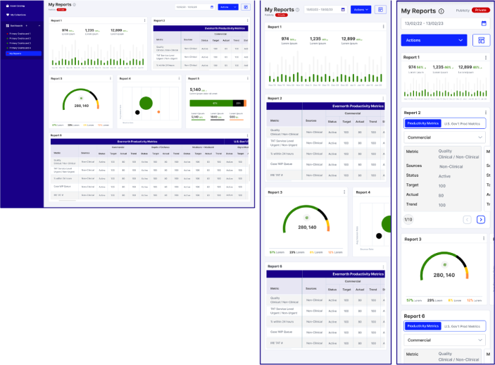
The dashboard builder flow is not user friendly.
-
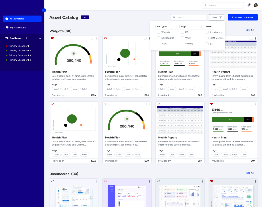
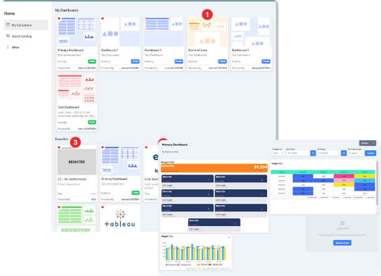
Trying to display too much cards and information on a single dashboard can overwhelm users.
-
Poorly chosen charts or graphs can make it difficult for users to interpret data.
-
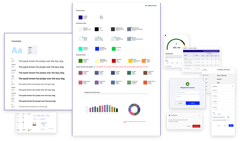
Inconsistent use of colors, fonts, and layouts across widgets can create a disjointed user experience.
-
Portal is not responsive
-
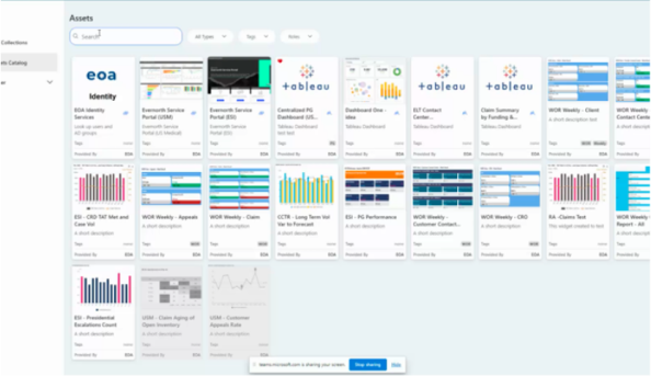
Table widgets are like table format. We can show case them in different and interactive way.
-
Content is not accessible
Project Solution
-
Creating user friendly flow for dashboard builder
-
Prioritize key metrics and use progressive disclosure for additional details in Dashboard.
-
Select appropriate data visualization types for different data sets and provide clear labels and legends to charts/graphs.
-
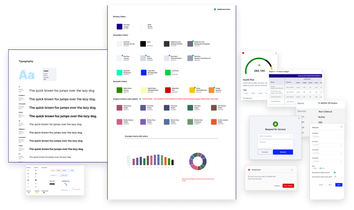
Establish a style guide for consistency in design elements throughout the dashboard.
-
Implement responsive design principles to ensure the application adapts to various screen sizes and orientations.
-
Creating different types of widgets for tables